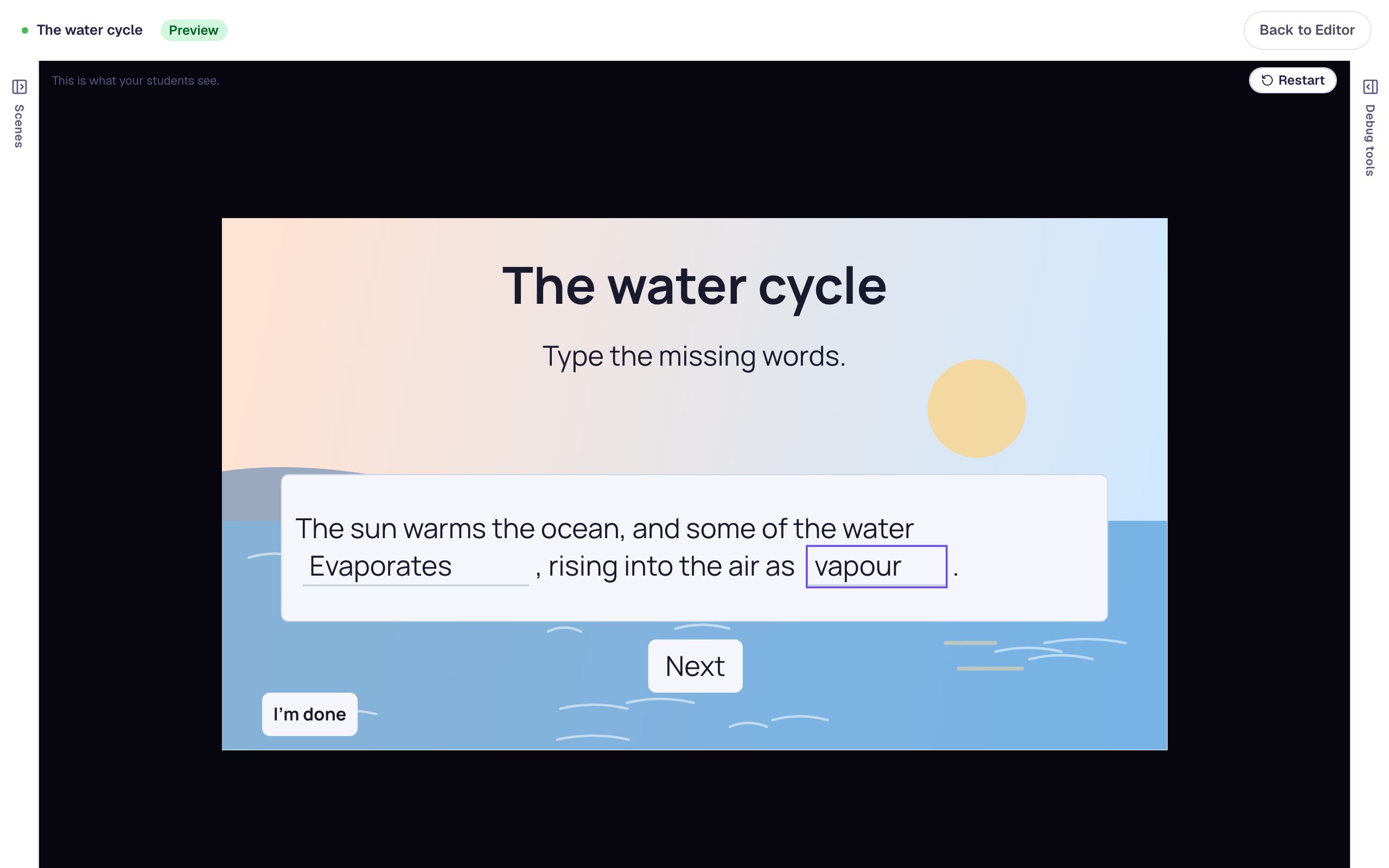
Restyle a row of buttons all at once
Build one button, copy it three times, then select all four and change their size, weight, colour, corners and width in one pass. Finish by giving each button a colour of its own.
- Level
- Beginner
- Time
- About 10 min
- Steps
- 9
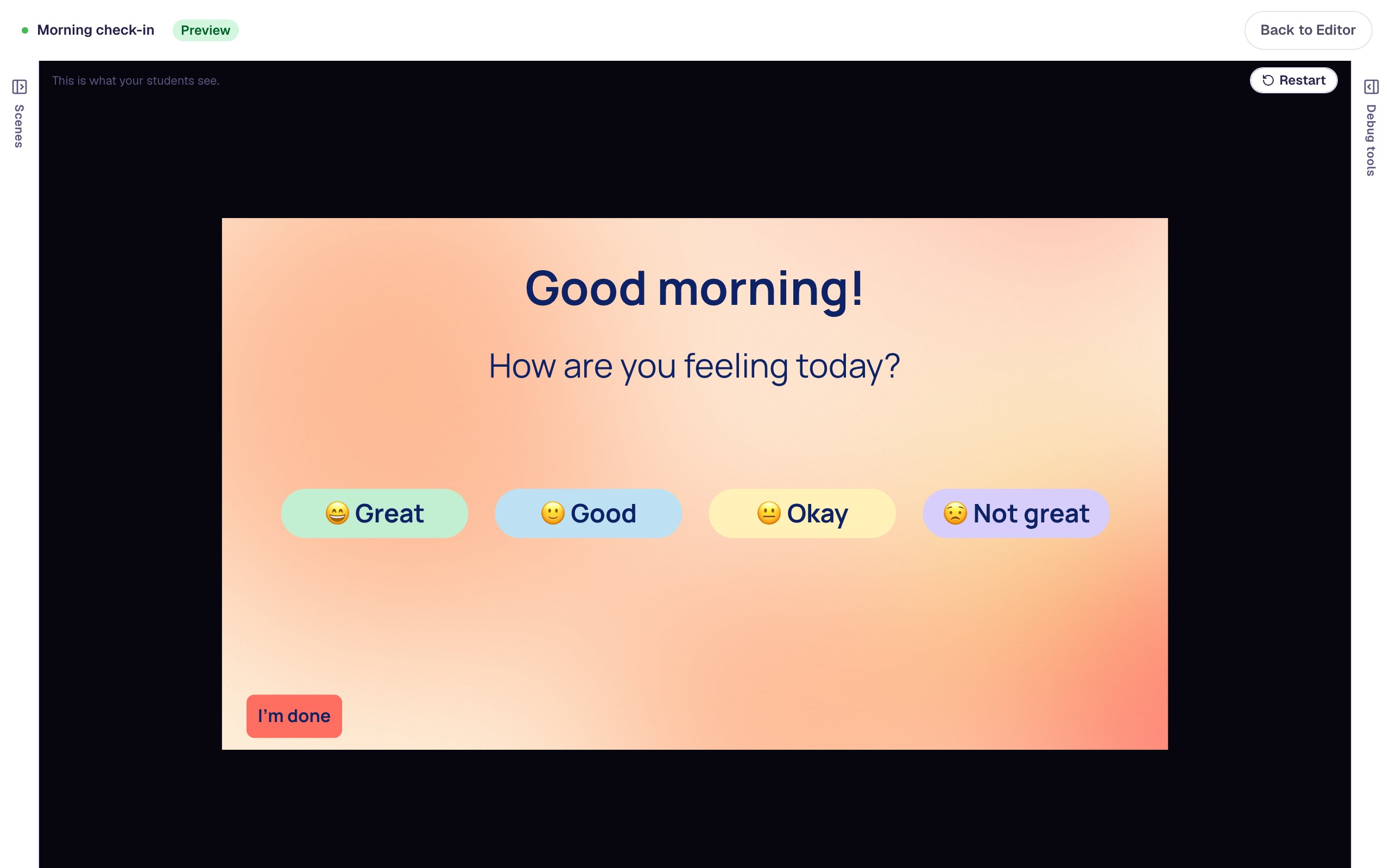
A "Morning check-in" scene where students tap one of four rounded, evenly sized mood buttons, each in its own soft colour, and the lesson thanks them for checking in.
Get the finished lesson
Skip straight to the result, or keep it open beside the steps. Add this tutorial's lesson to your account and explore how it works in the studio.
Free to sign up, and you'll come straight back here. I have an account
A row of buttons only looks finished when every button matches: the same size, the same lettering, the same rounded corners. Making that happen one button at a time means opening each one in turn, setting the same five values four times, and hoping you didn't miss one.
In this tutorial you'll build a morning check-in, where students tap how they're feeling. You'll make one button, copy it, then select all four and restyle them together. Along the way you'll see what Mixed means in the properties panel, how one Undo puts all four back, and which settings stay with each button. If you've never added a widget before, start with Build your first quiz question.
Step 1: Set up the check-in scene
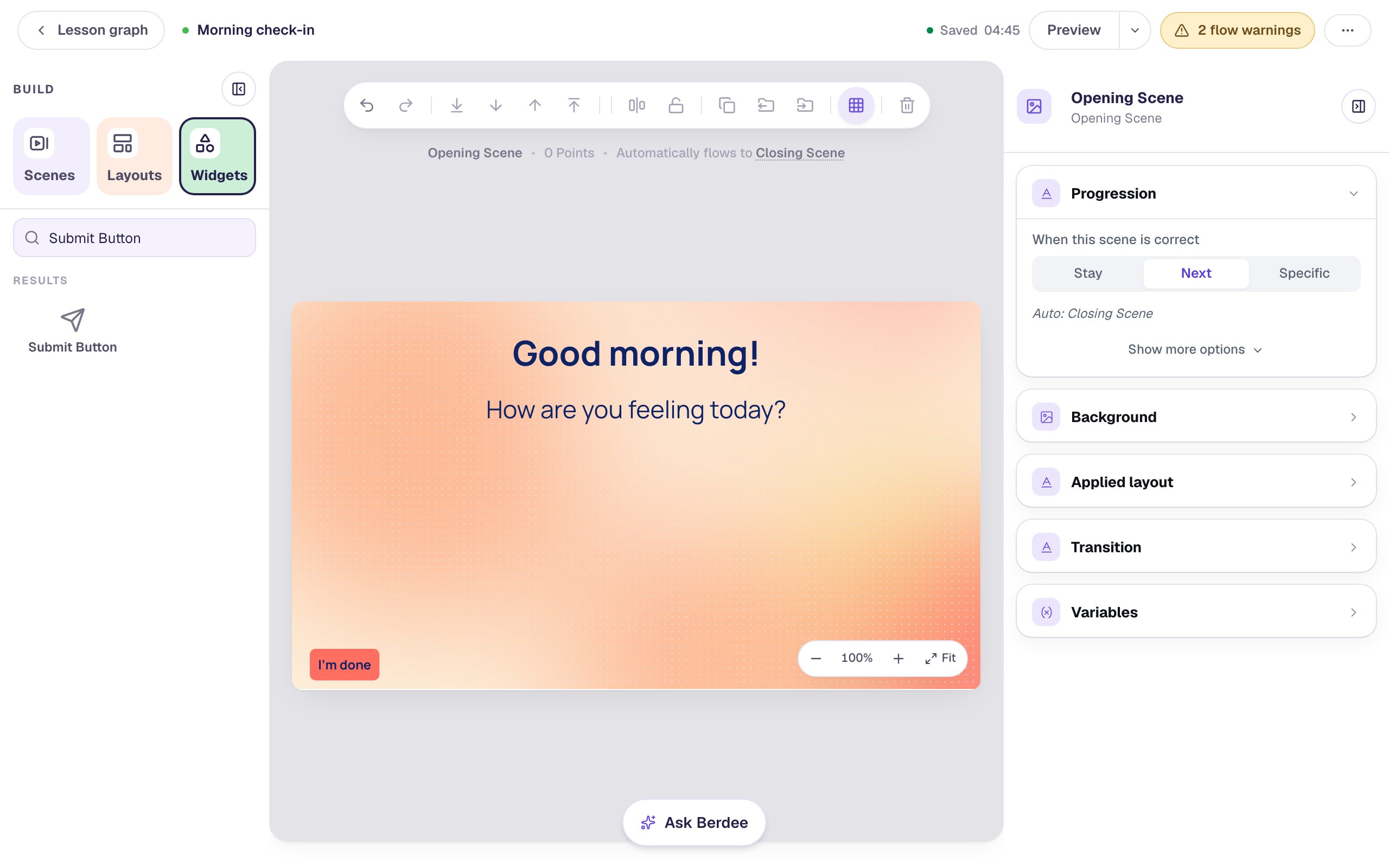
Start a blank lesson and name it (we used Morning check-in). Click an empty part of the canvas, open Background in the properties panel, click Choose a style, and pick Mesh sunrise from Gradients. A warm morning sky suits a check-in.
Add a Heading that says Good morning! and a Body underneath that asks How are you feeling today?. We set them to 48 and 34 px and gave both the dark navy Text Color from the colour picker, so they read clearly on the gradient.
Every lesson needs one button that finishes it, so add a Submit Button, set its Label to I'm done and Submits to Lesson, and tuck it into the bottom-left corner.
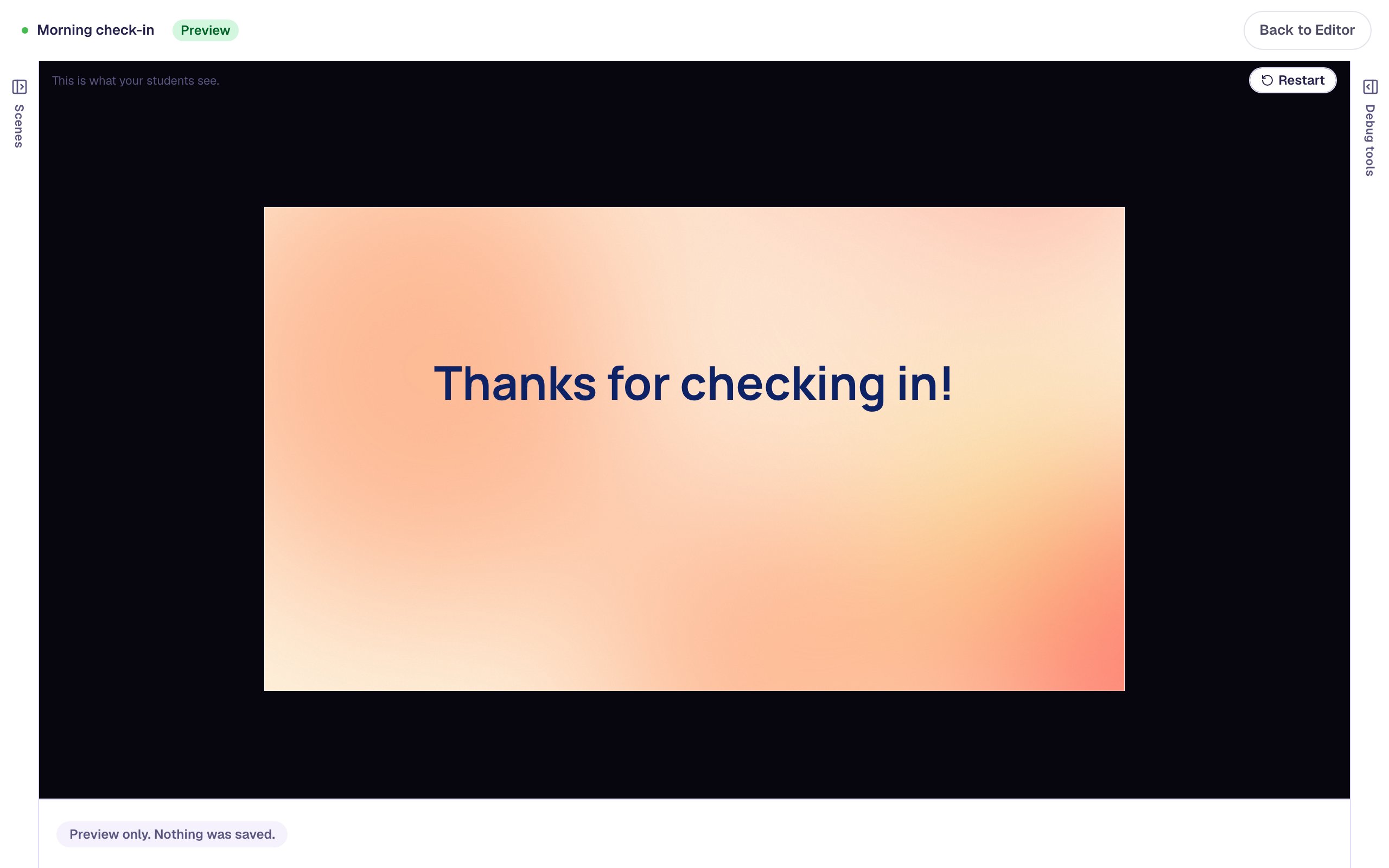
Then open the Closing Scene from the Scenes tab, give it the same background, click its headline, and change the text to Thanks for checking in! with the same navy colour. That's what students will see after they answer.
Step 2: Make the first button
Search the Widgets tab for Button and click it. With the new button selected, click ⚙ Configure, change the Label to 😄 Great (an emoji helps younger students who are still learning to read), and click Save.
Now make it take the student onward. Click Behaviors on the floating bar above the button, choose Make this a "Next" button, and click Add behavior. Drag the button to the left side of the scene, under the question.
Setting up the behavior _before_ you copy is the trick that saves work: every copy comes with it.
Step 3: Copy it three times
With the button still selected, press ⌘ D (Ctrl D on Windows). A copy appears just to its right, already selected. Open its ⚙ Configure and change the label to 🙂 Good. Do the same twice more for 😐 Okay and 😟 Not great, and drag the copies into a row.
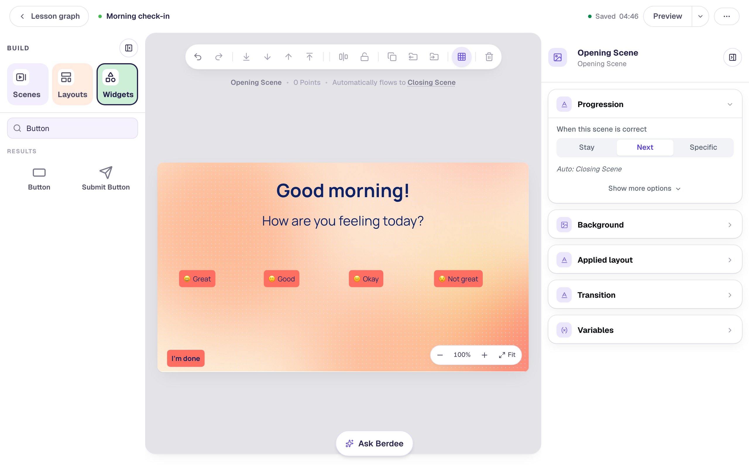
All four already work: each is a "Next" button, just like the one you copied. But they're small, and each is as wide as its own label, so the row looks uneven.
Step 4: Select all four
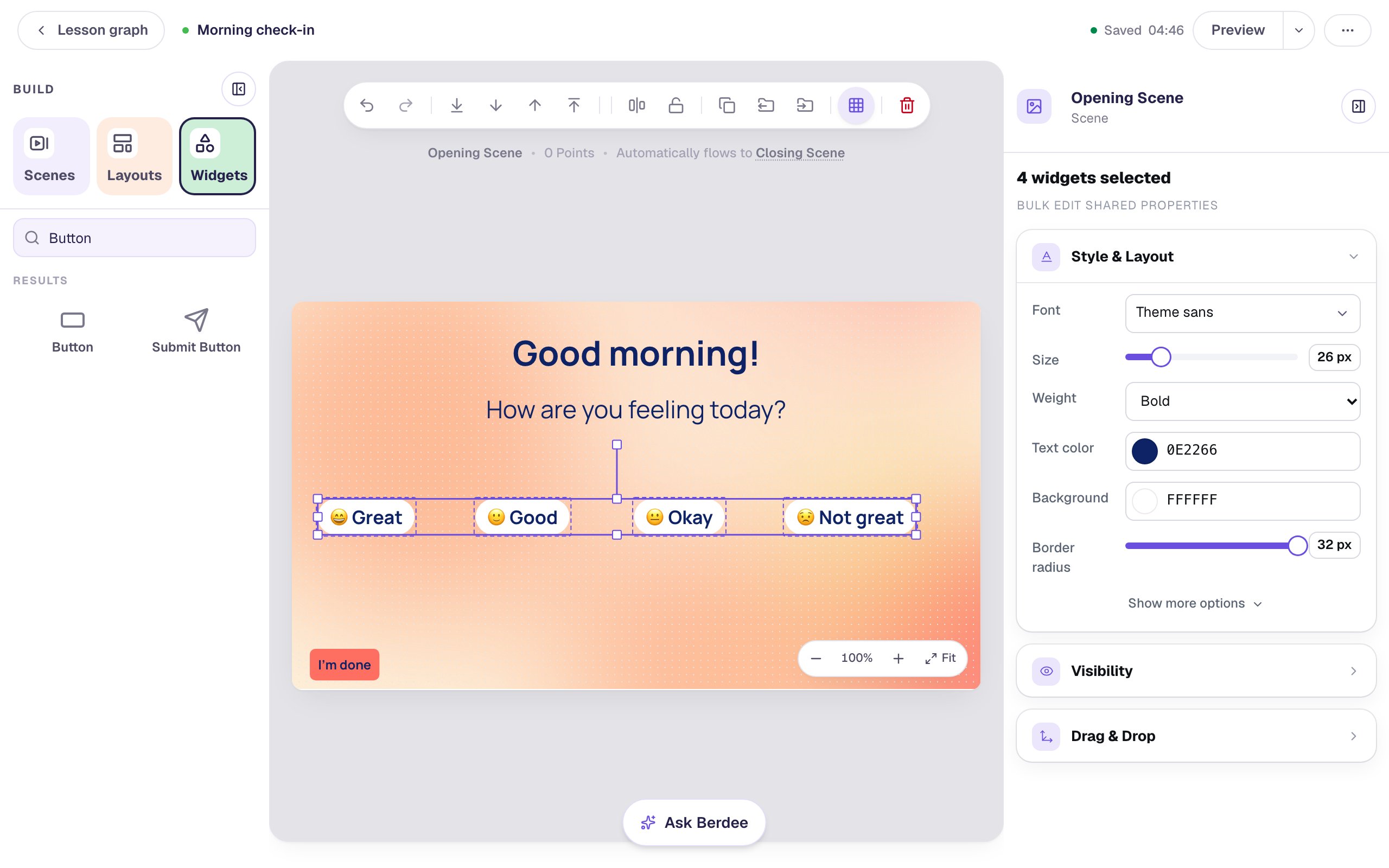
Click Great, then hold Shift and click each of the other three. One selection box wraps all four, and the top of the properties panel says 4 widgets selected.
The panel now shows only the settings all four buttons share: Font, Size, Weight, Text color, Background and Border radius. Whatever you change here changes on every selected button.
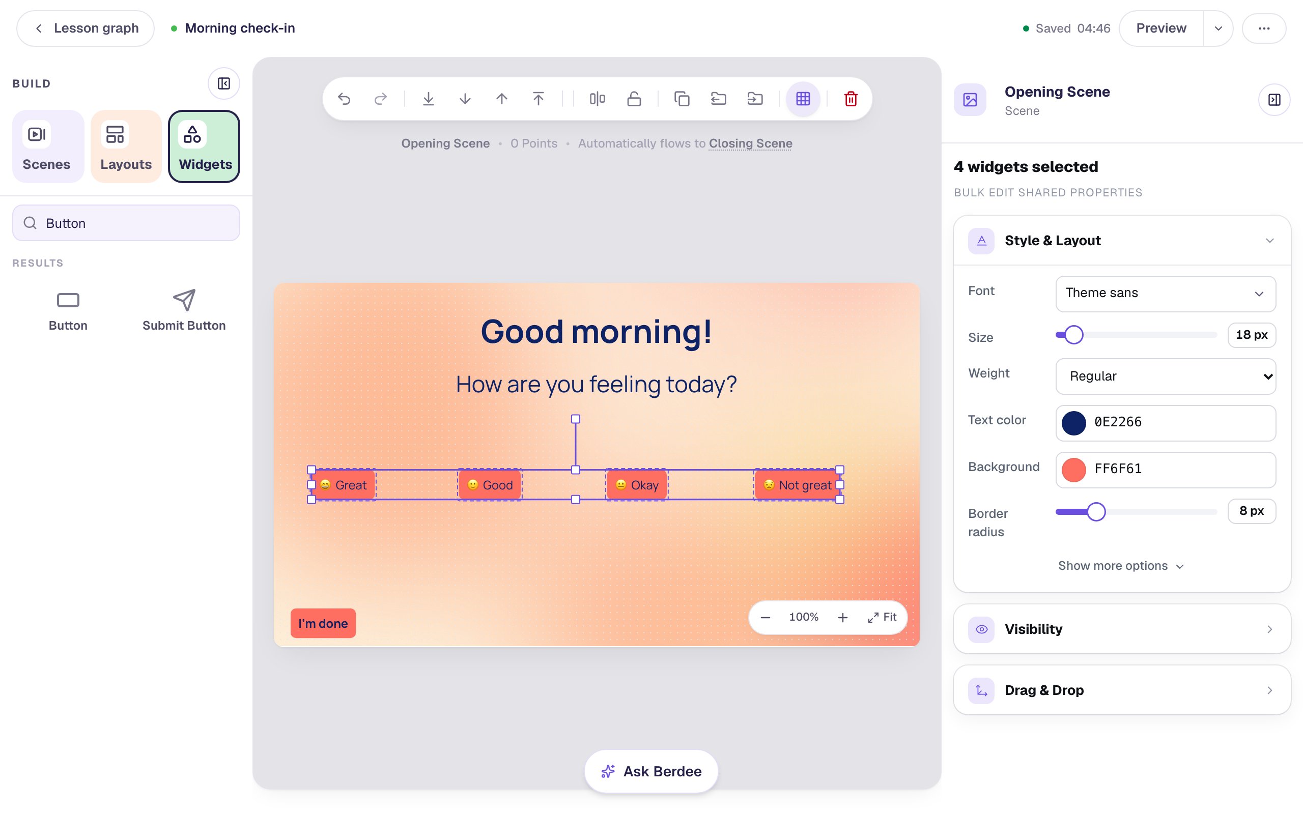
You can also drag a box around the buttons from an empty part of the scene, or press ⌘ A to select everything on the scene. Here ⌘ A would catch the heading too, which would hide the button-only settings, so Shift-click is the better choice.
Step 5: Restyle all four together
With all four still selected, work down the Style & Layout section:
- Drag the Size slider to
26px. A slider applies when you let go, so all four grow at once. - Set Weight to Bold.
- Click the Background colour and pick white.
- Drag Border radius all the way to
32px, which turns every button into a soft pill.
That's four settings changed on four buttons, sixteen edits, in four moves.
Step 6: Give them one width, even when it says Mixed
The buttons still have different widths, because each one was as wide as its label. Click Show more options at the bottom of Style & Layout. The Width field is empty and says Mixed:
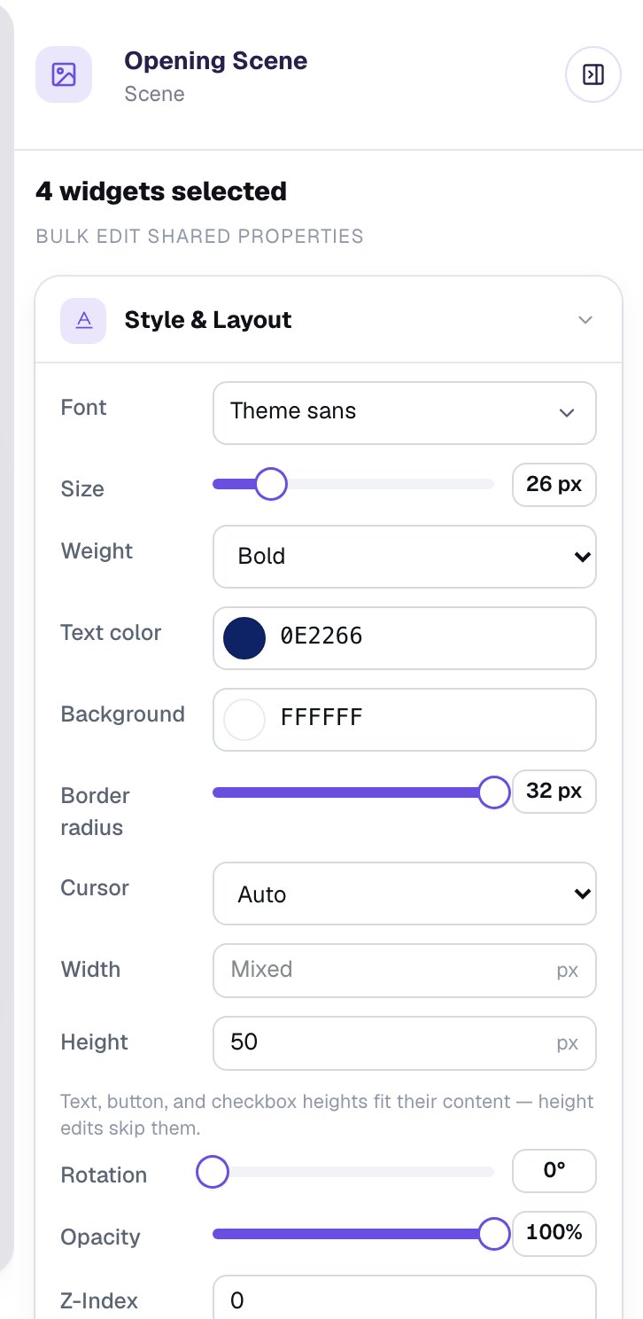
Mixed isn't a value. It means the selected buttons have different widths, and the field won't change any of them until you type a number. Click into Width, type 190, and press Enter. Every button is now exactly 190 wide.
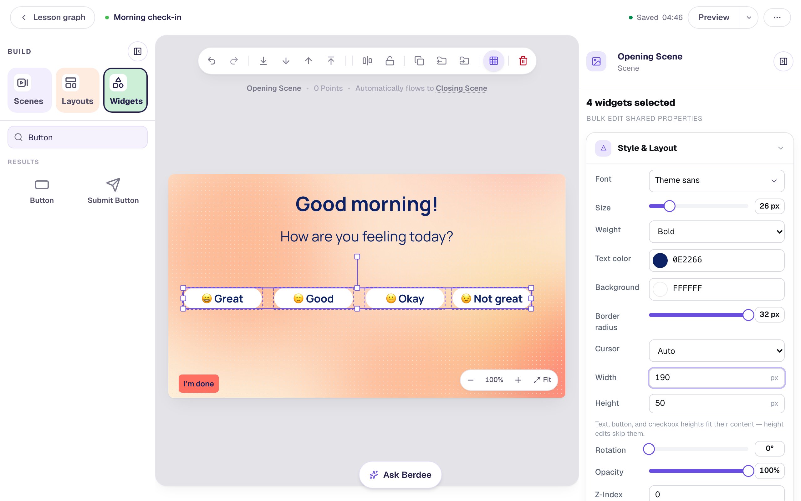
Under Height there's a note that button heights fit their text, so a height change skips them. A button grows taller when you raise its font size instead.
Step 7: Undo the whole change at once
Changing several widgets is one step in the studio's history, however many it touched. Click Undo in the toolbar above the canvas (the curved arrow on the left), or press ⌘ Z. All four buttons go back to their old widths together, and Width says Mixed again. Click Redo next to it to bring the change back.
Your row is probably still a little uneven, because you dragged the copies into place by eye. With all four selected, open Align & distribute in the toolbar and click Tidy up to even out the gaps. Then drag the row so it sits in the middle of the scene.
Step 8: Give each button its own colour
Some settings belong to one widget, not the group: a button's label, its behaviors, and anything you want to be different on purpose. A colour for each mood is one of those.
Click an empty part of the canvas to let the selection go. Click Great on its own, open its Background colour, and pick a pale green from the colour picker.
Do the same for the others: pale blue for Good, pale yellow for Okay and pale lilac for Not great. Keep the colours light, so the navy text stays easy to read.
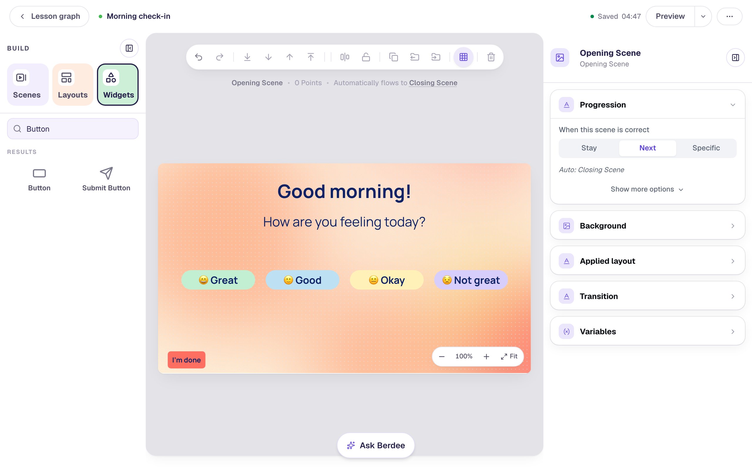
The size, weight, corners and width you set together are still the same on all four. If you change your mind about one of them later, select all four again and change it once.
Step 9: Try it as a student
Click Preview and tap a mood:
Students see the row exactly as you styled it:
Whichever button they tap, they land on the ending you wrote. A check-in has no right answer, so there's no score on it:
What you built
A morning check-in with four matching mood buttons, styled together instead of one by one:
- one button set up completely, with its label and Make this a "Next" button, then copied with ⌘ D so every copy kept its behavior,
- Shift-click to select all four, and a properties panel that shows only what they share,
- Size, Weight, Background and Border radius changed for all four at once,
- a Width that said Mixed until you typed one number for all of them,
- one Undo that put all four back, and Tidy up to even the gaps, and
- a colour for each mood, set one button at a time.
The same move works for any group of widgets: a set of picture cards, a row of labels, every answer on a scene. Select them, change the shared settings once, then fine-tune the ones that should differ. To keep a row like this perfectly straight while you build around it, try Line up a row of pictures with Tidy up, Gap, and Lock. To give every scene in a lesson the same look, try Give every question the same frame with a layout.
Make this lesson yours
Add the lesson you just watched being built to your account, then change it for your class: your questions, your pictures, your colors.
Free to sign up, and you'll come straight back here. I have an account