Line up a row of pictures with Tidy up, Gap, and Lock
Drop four pictures and their names roughly where they go, then let the Align & distribute menu line them up, space them evenly, centre them, and lock the finished row so it can't be knocked out of place.
- Level
- Beginner
- Time
- About 10 min
- Steps
- 8
A "The four seasons" scene with a centred title, four evenly spaced photos with a name centred under each, and a question underneath. Students answer it, and the row they look at is perfectly straight.
Get the finished lesson
Skip straight to the result, or keep it open beside the steps. Add this tutorial's lesson to your account and explore how it works in the studio.
Free to sign up, and you'll come straight back here. I have an account
A scene where one picture sits a little low and the gaps are all different sizes looks rushed, even when the content is great. Students notice it too: a tidy scene is easier to read, because their eyes can follow the row.
You don't have to nudge widgets into place one pixel at a time. In this tutorial you'll drop four season photos roughly where they belong, then let the studio's Align & distribute menu do the careful part: line them up, space them evenly, put a name under each one, and lock the finished row. It ends with a question underneath, so you can try it as a student. If you've never added a widget before, start with Build your first quiz question.
Step 1: Add a title and centre it on the scene
Start a blank lesson and name it (we used The four seasons). Click an empty part of the canvas, open Background in the properties panel, and click Choose a style. We picked Lagoon gradient, and gave the Closing Scene the same one so the ending matches.
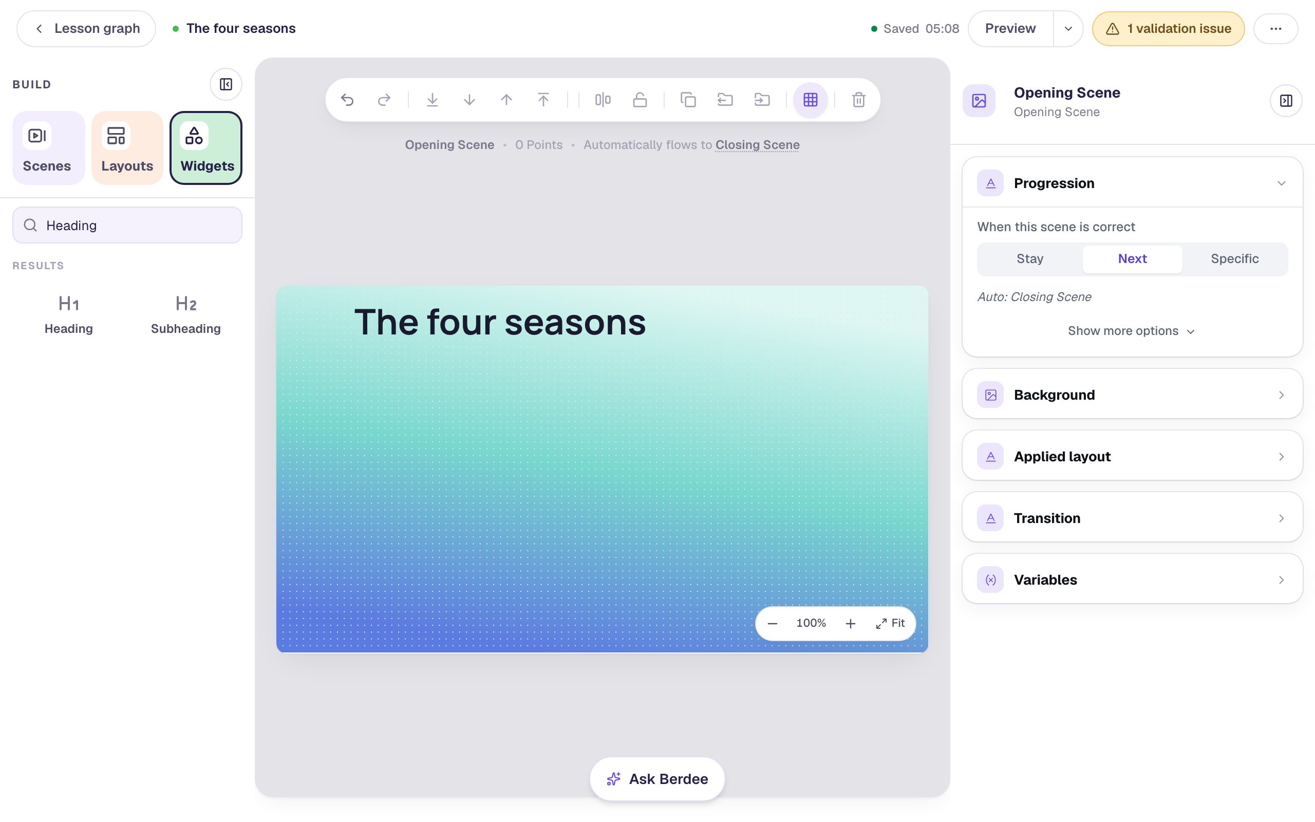
From the Widgets tab, add a Heading and type The four seasons. It probably isn't quite in the middle. Dragging it until it looks centred is guesswork:
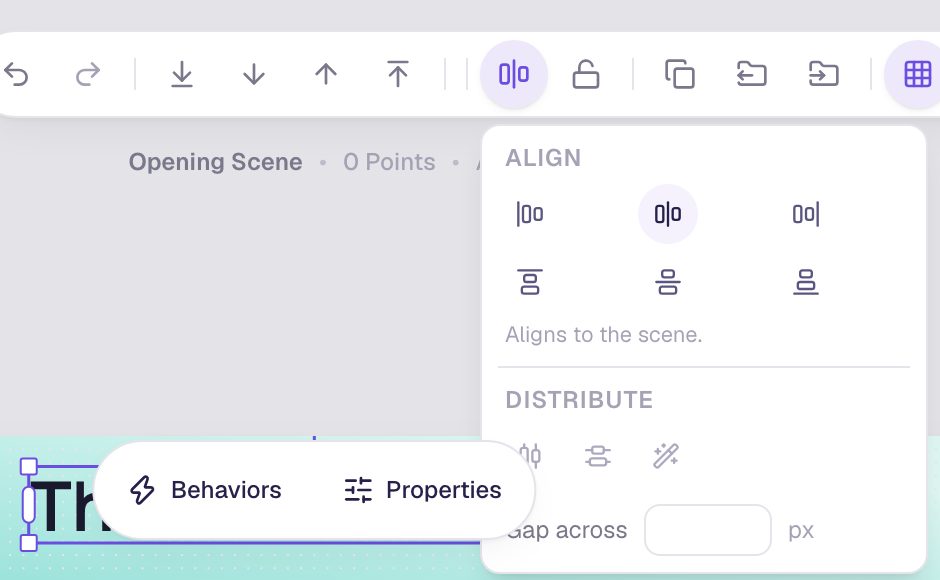
Select the heading, then click the Align & distribute button in the toolbar above the canvas (the icon with two boxes on a line). The menu opens with Align buttons at the top. With only one widget selected, it says Aligns to the scene. Click Align horizontal centres, the middle button in the top row.
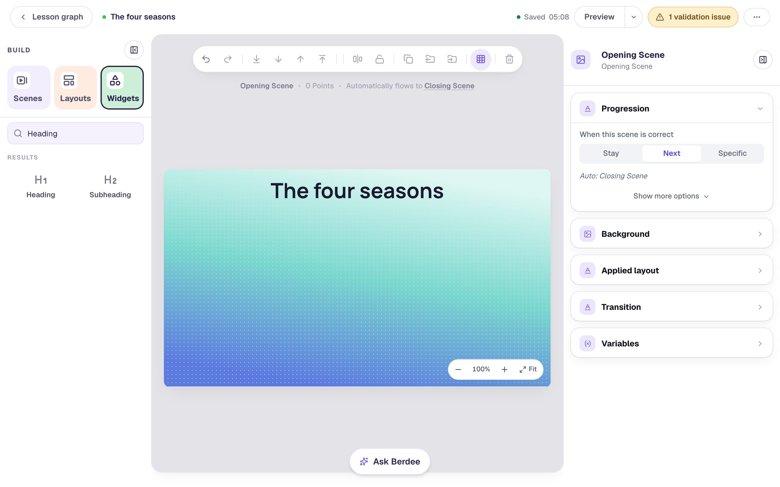
The heading jumps to the exact middle of the scene.
Step 2: Drop four pictures roughly in a row
Add an Image from the Widgets tab. With it selected, open Style & Layout, click Show more options, and set Width to 190 and Height to 140. Click Choose image, search the stock photos for cherry blossom tree, pick a wide photo, and click Import & insert.
Then open Accessibility and type a short description in Alt Text, like Pink cherry blossom on a branch. A student using a screen reader hears that instead of the photo's file name.
Do the same three more times for summer, autumn and winter, each with its own alt text (we used A field of sunflowers, Fallen autumn leaves on the ground and A snowy forest). For the photos we searched for sunflower field, autumn leaves and snowy forest. Give every picture the same size, and drag each one roughly into place under the title. Don't fuss over it: here the pictures sit at different heights with uneven gaps, and that's fine.
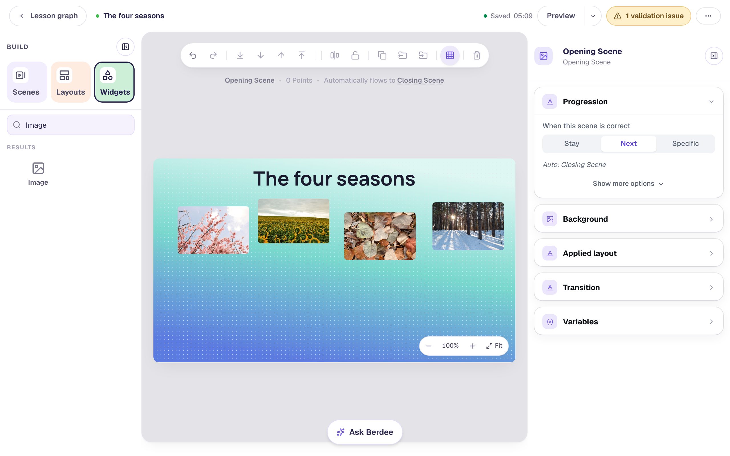
Put the first and last pictures where you want the row to start and end. The next step keeps those two where they are and fits the others in between.
Step 3: Tidy up the row in one click
Select all four pictures: click the first, then hold Shift and click each of the others. The properties panel says 4 widgets selected.
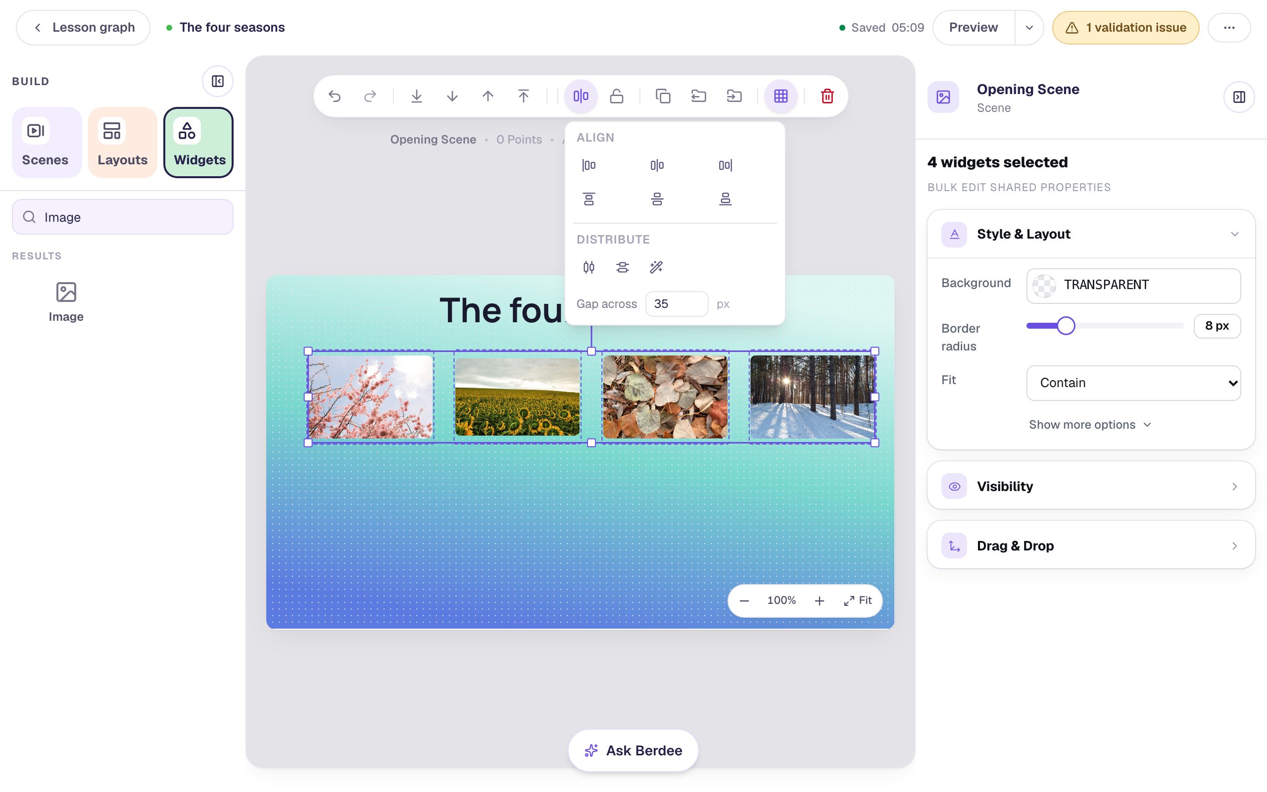
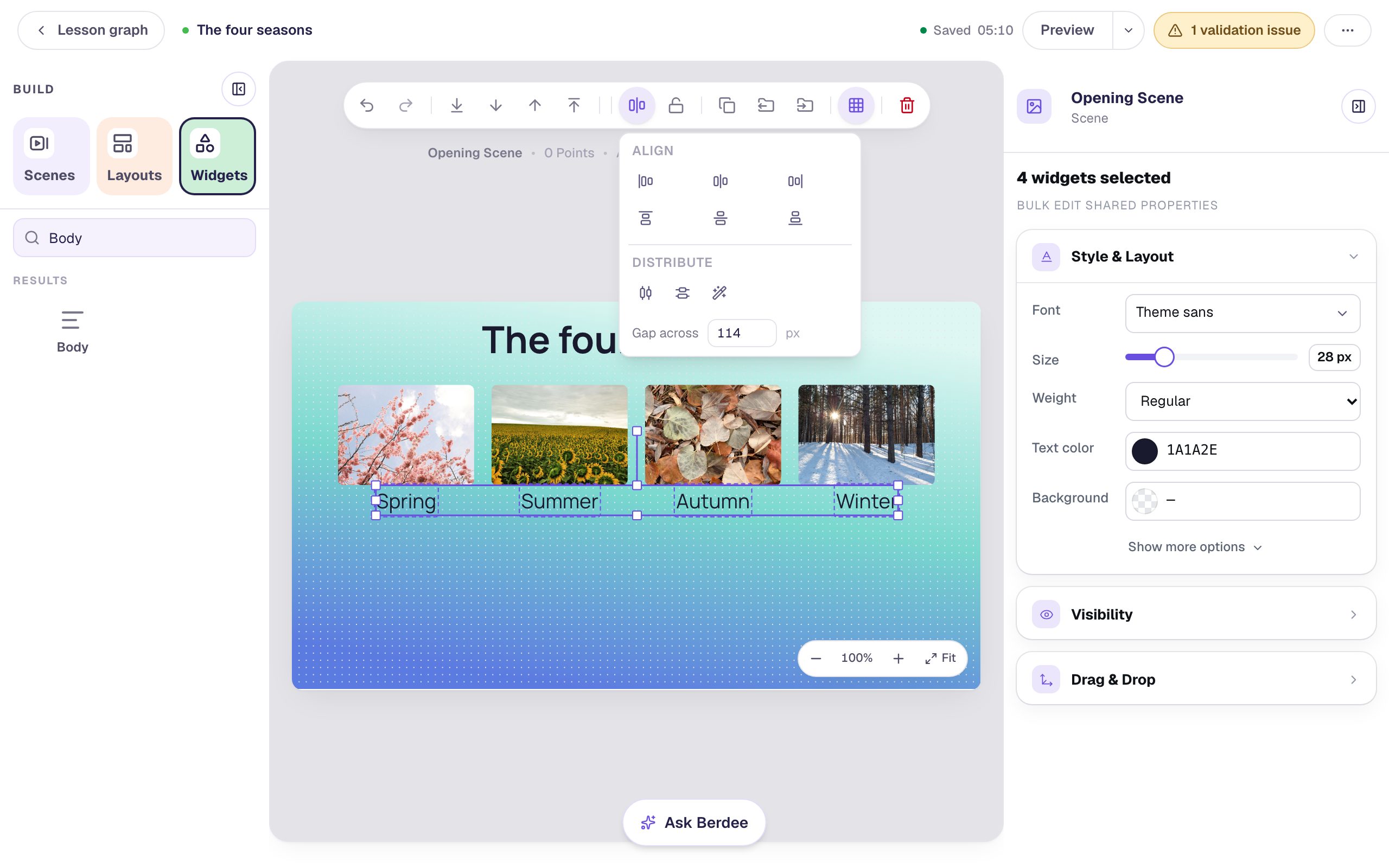
Open Align & distribute and click Tidy up, the magic-wand button under Distribute. Because the pictures are in one row, Tidy up lines up their middles and evens out the gaps between them, without moving the row anywhere else on the scene.
The row is straight, and the menu shows the gap it used under Gap across.
Step 4: Fill the frames and set an exact gap
Two finishing touches, with all four pictures still selected:
- Photos come in different shapes, so some leave empty bars in their frame. In Style & Layout, set Fit to Cover. Every picture now fills its frame, and you changed all four at once.
- In the Align & distribute menu, select the number in Gap across, type
24, and press Enter. The first picture stays put and the others close up to exactly 24 pixels apart.
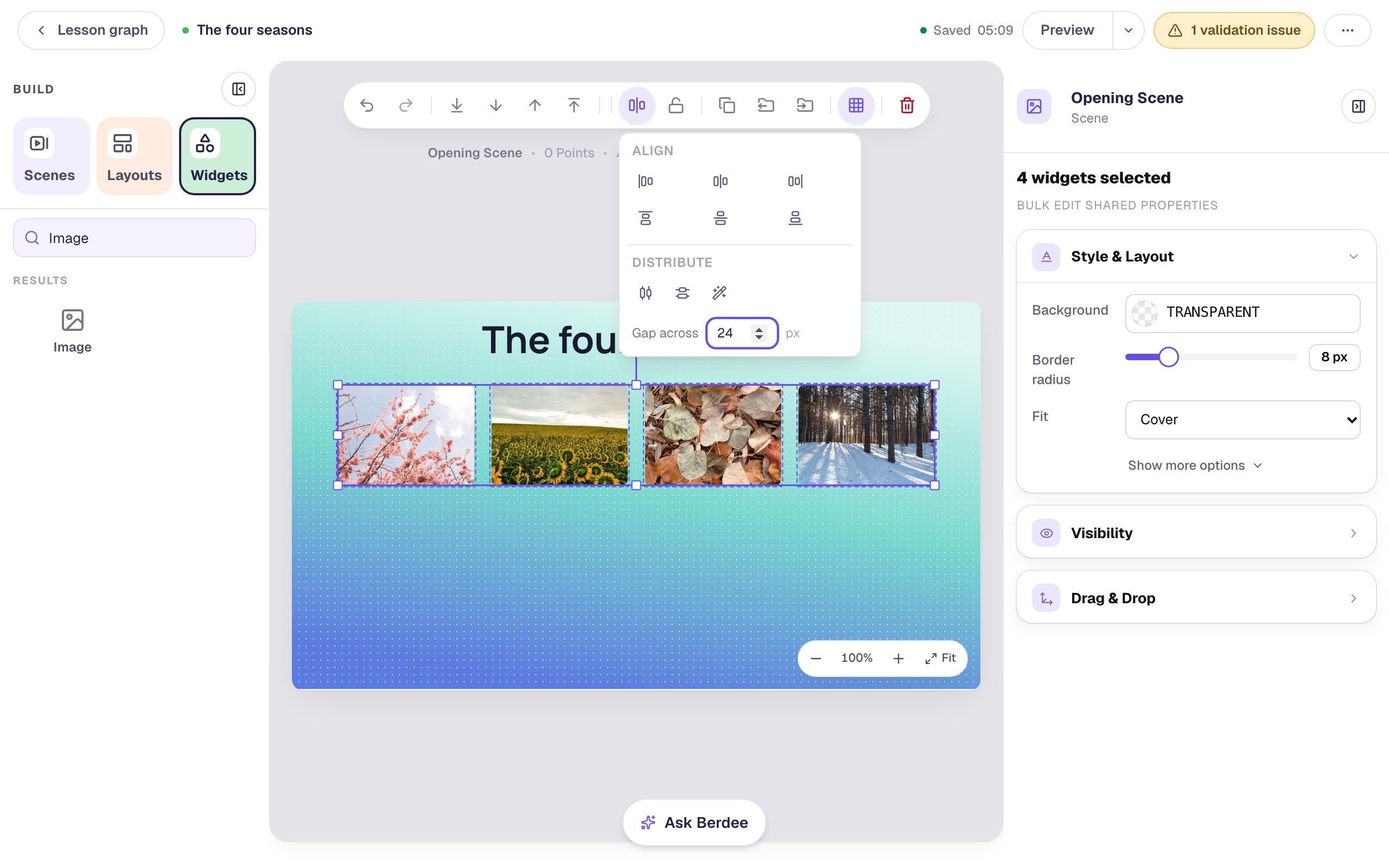
Why bother with an exact number? If every row of pictures in a lesson uses the same gap, the scenes feel like they belong together. Pick one number, like 16 or 24, and use it everywhere.
Step 5: Put a name under each picture
Add a Body text for each season, Spring, Summer, Autumn and Winter, at Font Size 28, and drop each one under its picture. Again, roughly is fine:
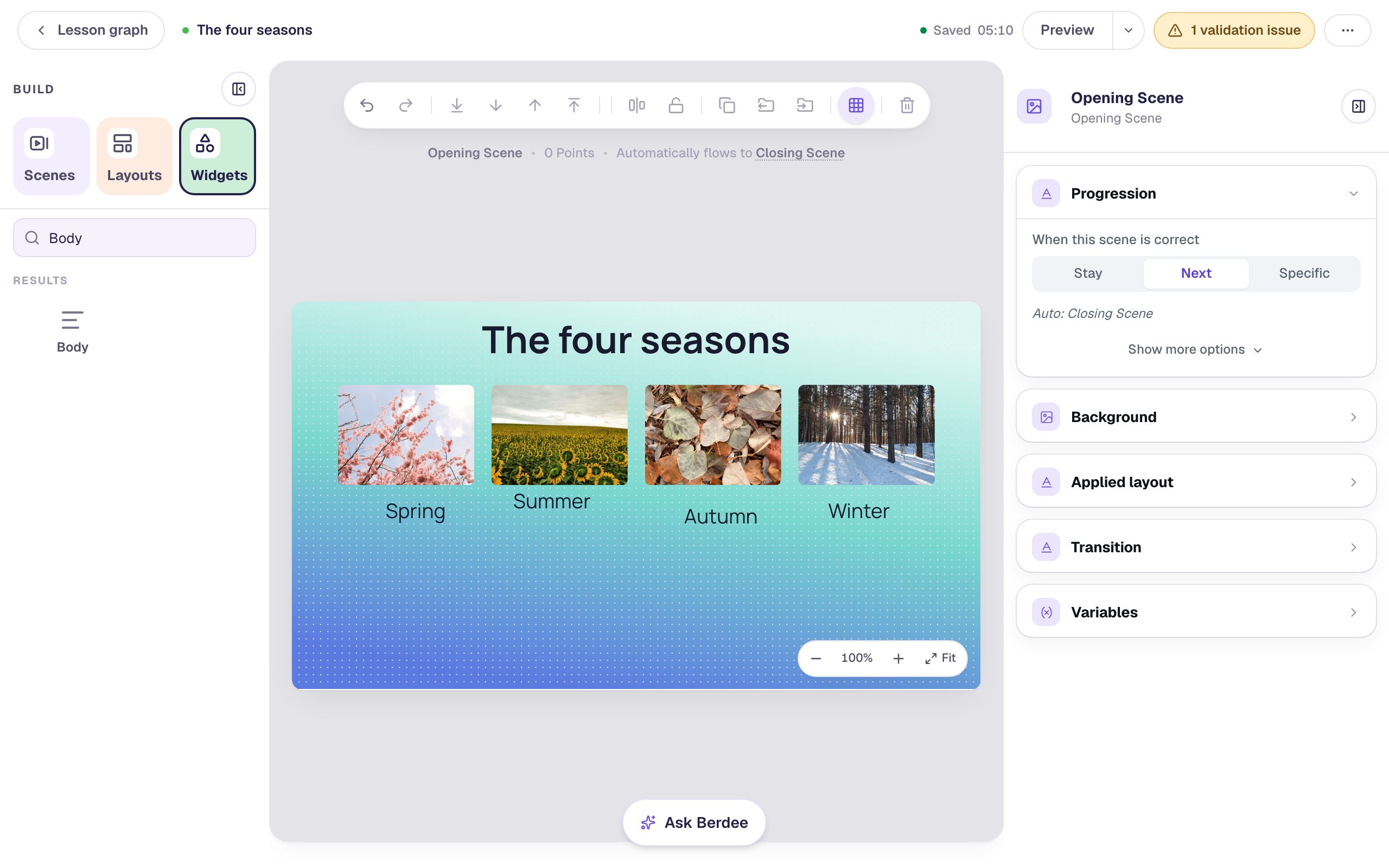
Now centre each name under its picture. Click the picture, Shift-click its name, and click Align horizontal centres. With two widgets selected, align lines them up with each other instead of with the scene. The name is narrower than the picture, so the name moves and the picture stays where it is.
Do the same for the other three. Then put the names on one line: click Spring, Shift-click the other three names, and click Align top. Every name moves up to the highest one.
Step 6: Lock the finished row
The row is done, but you're about to add more widgets right under it, and it's easy to grab a picture by accident. Lock it.
Drag a box across empty space around the pictures and their names, starting outside them, to select all eight at once. Then click Lock in the toolbar (the padlock beside Align & distribute). Locked widgets show a dashed outline instead of resize handles.
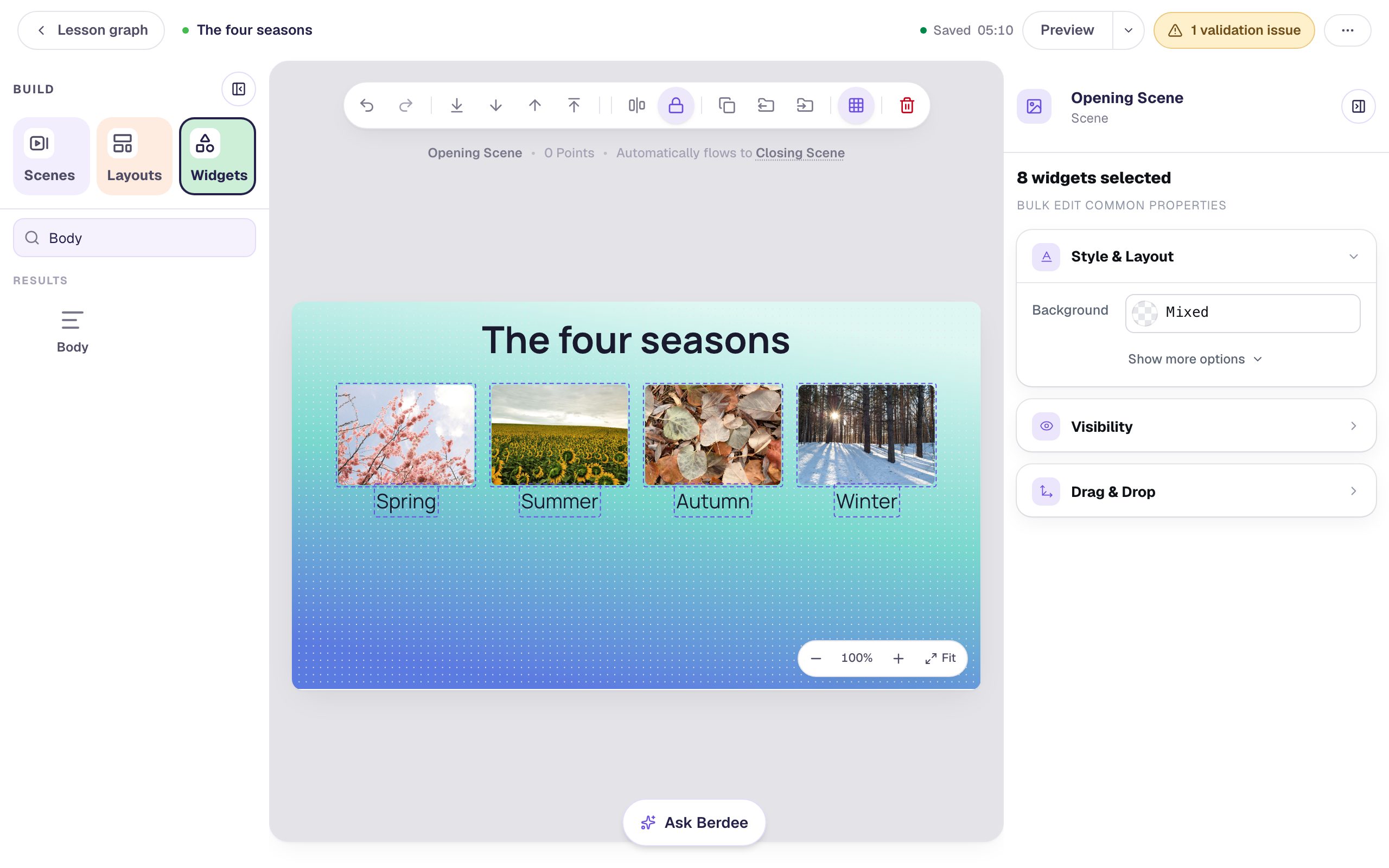
Try dragging one of the pictures. It stays exactly where it is:
Locked widgets still work for students; locking only affects editing. To change one later, select it and click the padlock again to unlock it.
Step 7: Add the question underneath
Now the row is safe, add the question below it:
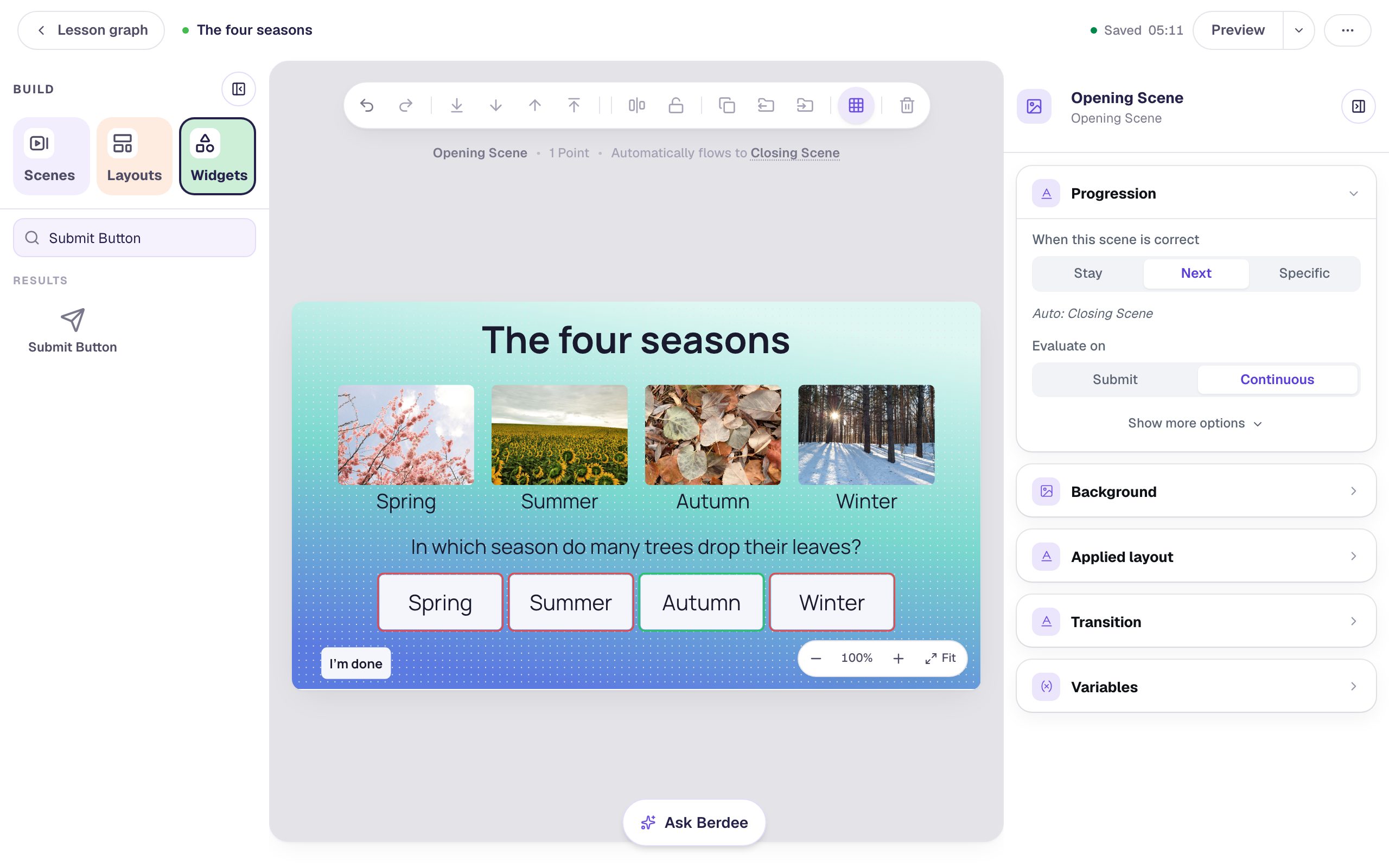
- Add a Body text,
In which season do many trees drop their leaves?, at Font Size 28. Select it and click Align horizontal centres to centre it on the scene. - Add a Multi Choice question. In Configure, type the answers
Spring,Summer,AutumnandWinter, and mark Autumn correct (the first answer starts marked; marking Autumn moves the mark). Click Save. - In Style & Layout, set Width to
720and Height to80so the four answers sit in one row, set Font Size to 30, and turn on Show correctness. Drag it under the question and click Align horizontal centres once more. - Add a Submit Button, set its Label to
I'm doneand Submits to Lesson, and put it in the bottom-left corner. Every lesson needs one button that finishes it.
Step 8: Try it as a student
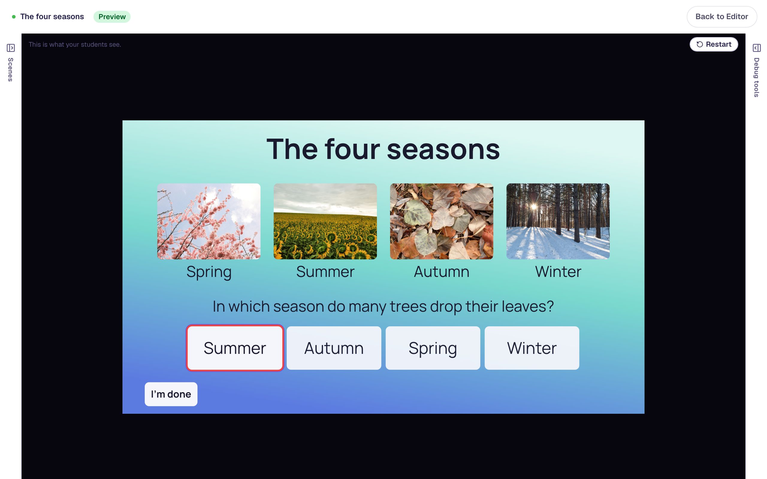
Click Preview. Try a wrong answer first, then the right one:
The answers are shuffled for every student, so they may be in a different order than in the studio. A wrong pick turns red:
Autumn is right, so the scene moves on to the Closing Scene:
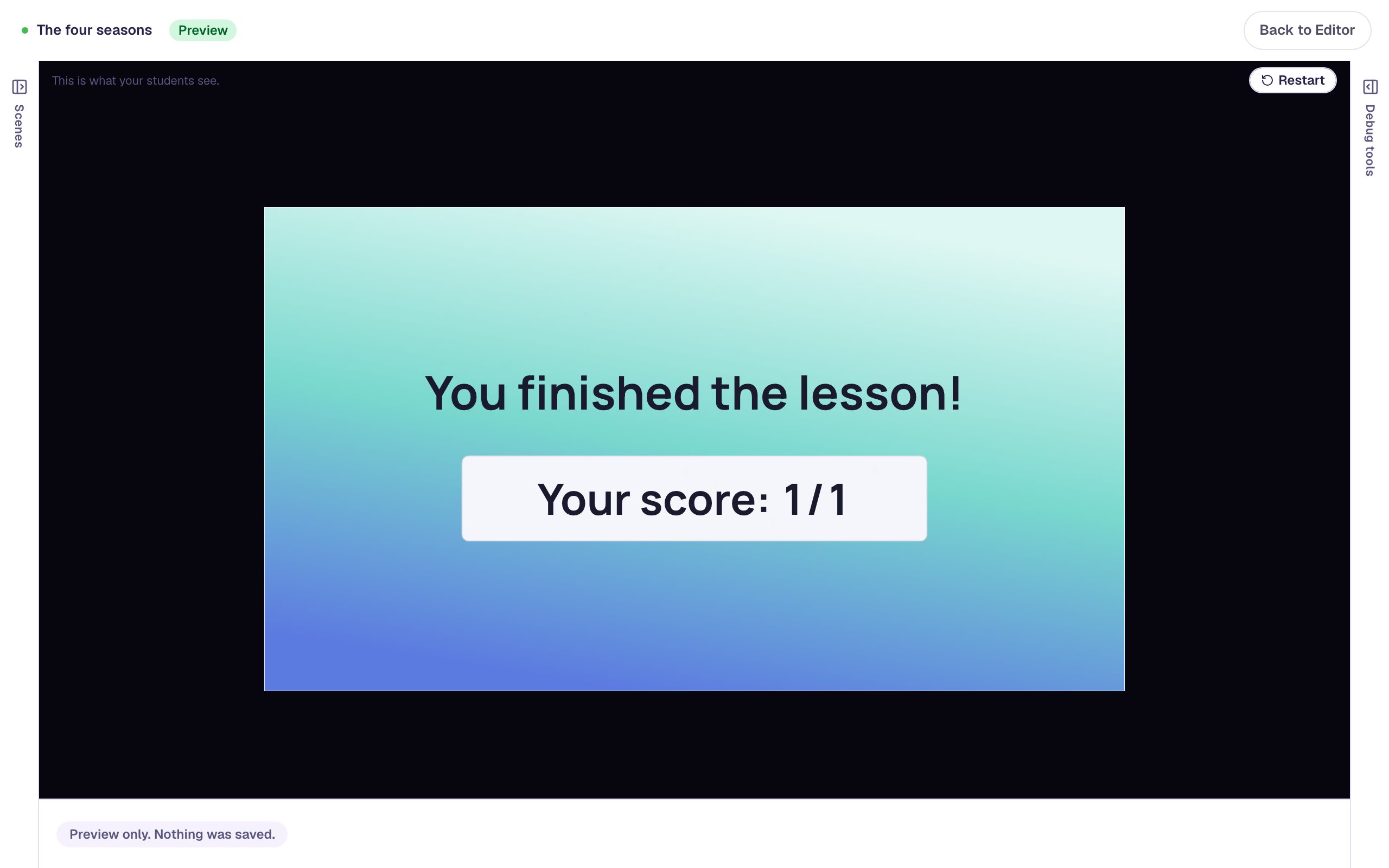
What you built
You built a scene where everything lines up, without nudging anything by hand:
- Align horizontal centres with one widget selected centred the title on the scene,
- Tidy up turned four roughly placed photos into a straight, evenly spaced row,
- Gap across set the spacing to exactly 24 pixels, and Fit: Cover filled every frame at once,
- Align horizontal centres and Align top put each name centred under its picture, on one line, and
- Lock kept the finished row safe while you built the question underneath.
The same workflow works on any scene: drop widgets roughly, select the group, Tidy up, set a Gap, and Lock what's finished. To change the look of a whole row at once, size, colour and corners included, try Restyle a row of buttons all at once. For a whole quiz with the same look on every question, try Give every question the same frame with a layout. For a question whose answers are photos, try Ask a "select all that apply" question with pictures.
Make this lesson yours
Add the lesson you just watched being built to your account, then change it for your class: your questions, your pictures, your colors.
Free to sign up, and you'll come straight back here. I have an account